Buskee
UX, UI Project | Duration : 4 months
Buskee is a conceptual design project for London “buskers”, the street art performers, often misjudged as glorified beggars. Little know that the process to becoming one is complicated, left alone the competition of getting the performance spot.

Project duration : 6 weeks | team of 4 ( Product Designer, UX Researchers, UX Designer ) | Role : UX researcher, UX designer

The Problem
Did you know that it takes 6 months the least to get license for performing in public spaces?
Mayor of London started Busk in London program in 2015 aiming to make the city more open to street performances by tackling the complicated process and misconceptions about street performances.
The goal from this project is to explore ways of strengthening busking community to support each other for it could be very challenging for them to deal with the regulations, process, public reactions out from performing itself.
How Might We help you smoothly get into the busking world ?
How Might We help you be the busking guru?

The Design process
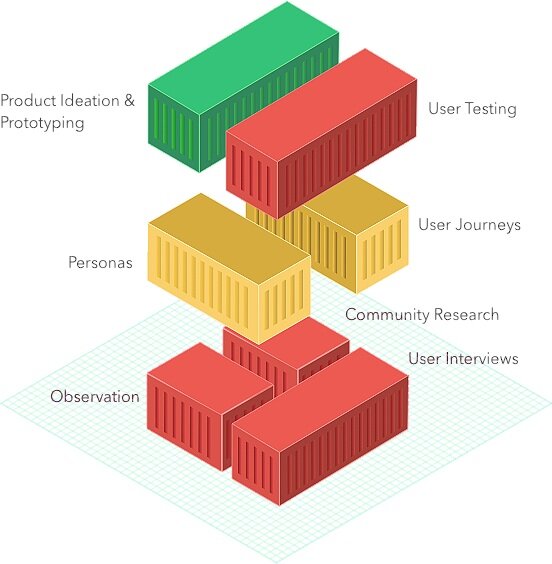
1. Observation, community research, interview. Facebook community, London busking websites, observing buskers performances, and doing in-depth interviews to give us insights about their day to day life as a busker
2. Personas and User Journeys. Using the information gathered from the first stage, we created personas and user journeys. They helped us outline the activity sequences and pain points.
3. Product Ideation & prototyping, User Testing. Defining user goals, device requirements, create design solutions, and test them
We discover some interesting point of views during our observation, community research, and user interviews
“Getting a smile back from someone is my favorite thing”
“ Busking can be a tough gig. But find yourself in with the right people and no matter what the outcome, you’ve got a good support system ”
Personas
We categorized busker into 2 categories : Beginner busker and Experienced busker.

Beginner busker persona

Experienced busker persona

User Journey
Outlining their activity sequences to define the pain point gaps and explore design ideas. We categorize busker’s activities to 3 main stages :
Finding pitch to busk
Preparation before performing
Sharing their performance
Each stages have pain points that inspire us in the design solution exploration.
“An unused spot is a waste for they could be opportunities for other buskers “
“ Finding a way to a pitch spots could be challenging if it’s a new spot he had never performed “ * this is the case with performing spots in London public transportation like Underground trains
“For newly starting musicians, performing in public spaces could be stressful and challenging. Lack of audience responses, engagement, ,listeners, public bullying cause discouragement.”
Problem Statements
A beginner busker, who feels alone and intimidated about busking in London, needs a way to receive emotional support to overcome the obstacles of being a street artist; but is unsure about who to reach out to in the community and how to do so.
An experienced busker, who feels confident in the level of busking knowledge they have, needs a way to share this information while quickly gaining busking information about uncharted pitches outside of their immediate busking friendships; but is unsure about how to achieve this.
Product Ideation
Scoping ideas to two user goals to define the main features.
User goals :
give and receive community support
provide busking information for the community
Promote performing buskers to community
Device requirements :
Easy to carry
Support communication function
Access to community content

Design Solution
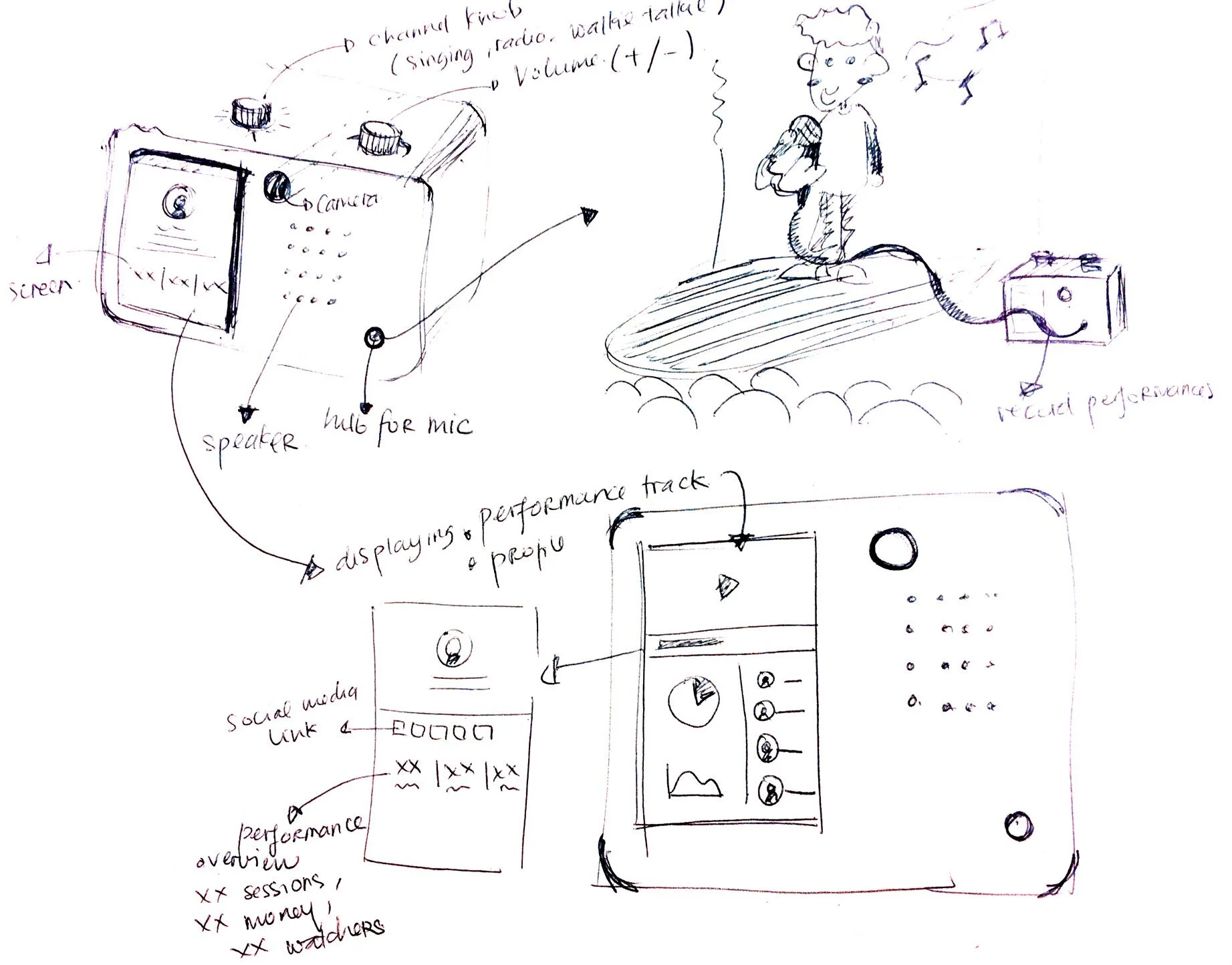
A device that is exclusive to busking community, a portable speaker with 3 main features :
Busk Mode. Live broadcast of performances with the option to leave reactions or feedback.
Profile Mode. Collects statistics on their performance, with the option of sharing them with the wider community.
Radio Mode. Map view of performing buskers and their availability for buddy busking.

Prototyping
We created a quick physical mock up along with the User Interface screens for each features ( Busk, Profile, and Radio mode ) to test the concept.
How It Works
Below is the use case scenario of Buskee speaker. We pictured how a busker use the device on a day of busking : How she gets ready, heading to the pitch spot, preparing the set for performance, and how Buskee will support her throughout the performing session.


User Interface


Busk Mode - The projector showcase artist profile and live emoji supports from the community. The goal is to provide emotional support for buskers and attract people to listen to them.
Busk Mode
This feature allows buskers to :
live broadcast performance to Buskee radio ( audio and video )
projects live reactions from community during performance.
Community feedback comes in reactions with positive graphic emojis ( samples inspired from Facebook emojis ) and voice messages. The messages are accessible on busker profile page where they will be tied under a performance recording.

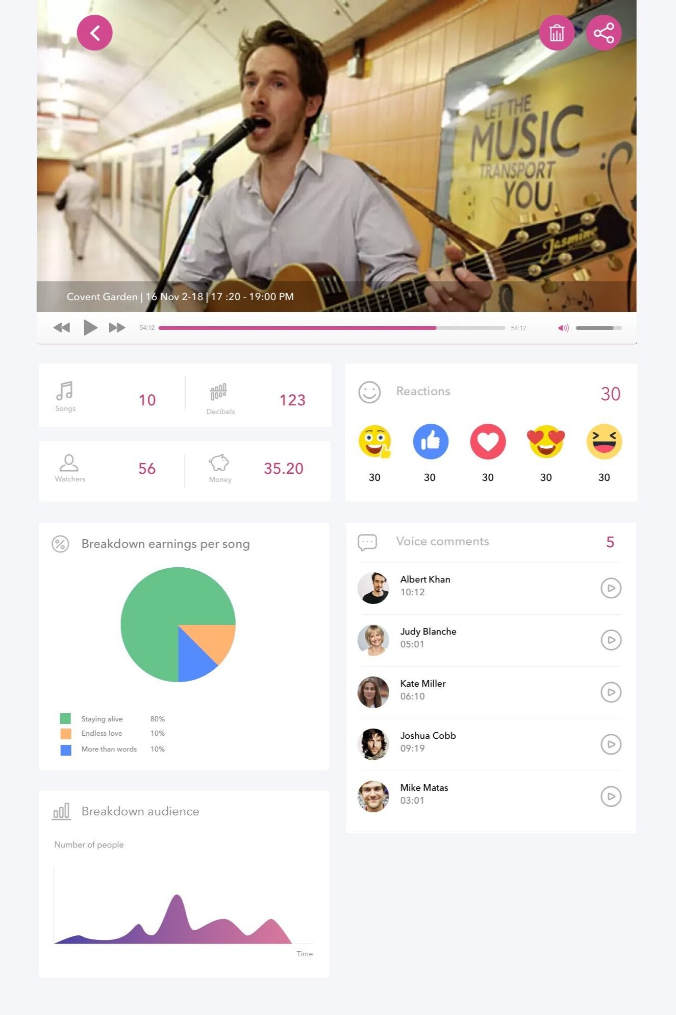
Profile Mode. A busker accessing his past performance recording from Buskee speaker projection. This feature helps busker assess his past performance, which songs earned the most money, how many reactions he got from busking community.
Profile Mode
This feature contains user’s details, summary of past performances, recorded performances, and setting.This is also where busker can access voice messages sent during their performances, share their performance data to the community.

A performance detail captured :
How many songs performed
Sound decibels
How many people watch
Money earned from the session ( connected to contactless payment device )
Emoji reactions from busking community during the live performance
Voice comments left from community members during the live performance

Radio Mode
A live broadcasting feature of performing buskers in London. This feature will track your location on by default and showcase performing buskers around you.
You can watch live performance on selected busker, send reactions and voice messages, moreover busk together if they turn their “busk with me”mode ON.

“Busk with me”
See which buskers playing around you. “Busk with me” status means the Busker open to play with other buskers on the pitch.
Usability Testing
Device Tactile Experience. We created a rough card board mockup with graphical buttons for participants to play interact with. “Wizard of Oz” testing method is used as participants flipping around the device by showing relevant screens with a laptop to replicate projector like experience.
Task Oriented Goals. Given 3 main task related to main features ( radio, busk, profile ) and analyse the success rate from each task. Using “think aloud” method to capture participants thoughts, comments, and actions to reflect further for iteration.
From the user test result, we highlighted some findings we can use for the future work
Some participants find it uncomfortable, having the device automatically broadcast your location to the community
Flipping gesture to change device mode barely use in any electronic device, therefore we should consider users learnability and iterate on less surface reactive approach in edge case where user accidentally flip the device.


